

本文主要讲解的是Excel2016表格中插入可视化地图的具体操作,大家想不想学习一下呢?想学习的就来看看吧。
1、Excel2016 地图绘制->三维地图->打开三维地图

2、设置地理字段,也就是位置。

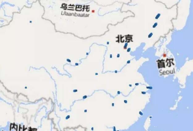
3、选择可视化图形。PowerMap提供的可视化图形有五类:堆积柱形图、簇状柱形图、气泡图、热度地图和区域。


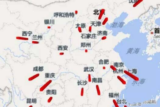
4、设置数据字段,也就是高度。柱形图的高度也就代表数据的大小。
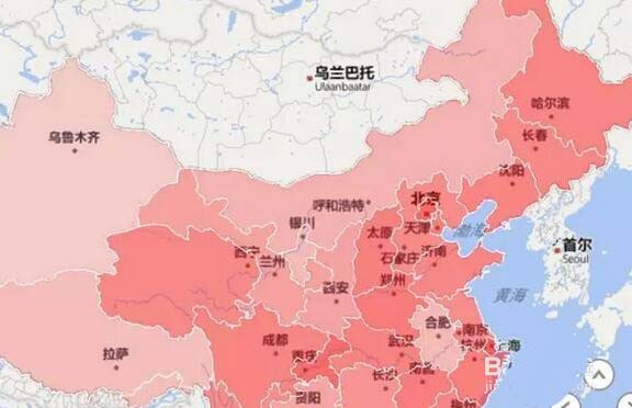
5、最常用的还是用颜色的深浅表示数值的大小。选中第五种图表类型即可。

6、当然,我们也可以把图形改为平面图形,点击右上角的平面图形即可
7、当然,我们可以调节颜色等,来美化地图。
以上就是Excel2016表格中插入可视化地图的具体操作,希望对大家有所帮助。


")
")


语音转文字!新媒体翻译者都有哪些实时语音转文本工具?")


