


如何在Excel中制作柱状图?下面就是在Excel中制作柱状图的步骤,一定有许多朋友很是期待吧。
1、录入数据。
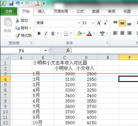
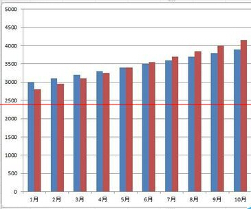
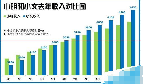
2、选择数据,插入柱状图,得到软件默认的柱状图。
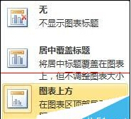
3、设计标题。在图表工具中选择图表标题→图表上方,然后输入需要的标题文字。设置标题字体和字号。选用笔划较粗的字体,使用大字号。
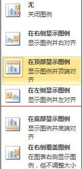
4、设计图例。选择在顶部显示图例,设置图例字体和字号。

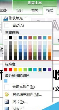
5、设计柱形填充颜色。点选相同系列柱形,在图表工具→格式→形状填充中选择颜色。

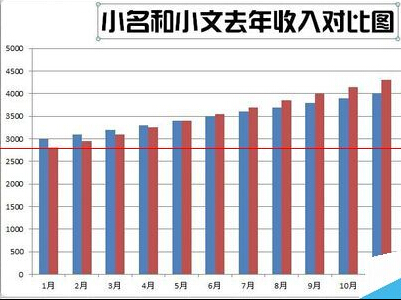
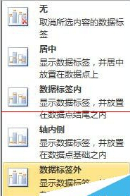
6、设计数据标签。每一张图都有想说明的重点,所以不必将每个系列的数据标签都显示出,本例显示出第二系列的数据标签。选择数据标签外,显示出数据标签,并对数据设置字体和字号,并选用与系列柱形相同的颜色。

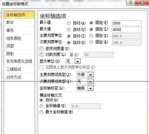
7、设计坐标轴。为了强化逐渐增加的趋势,可以将纵坐标轴的最大和最小刻度进行更改。因为已经显示出了数据标签,所以没必要再需要纵坐标轴,点击选择纵坐标轴,将其删除。点选横坐标轴,更改字体和字号。

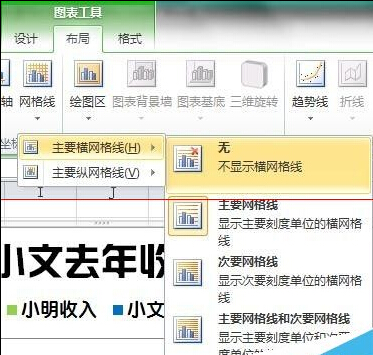
8、设计网格线。无需网格线,将其删除。

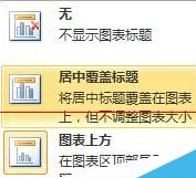
9、整体再设计。这一步需要具体问题具体分析。本图因为是逐渐增加的风格,所以需要强化这个增加的趋势。把标题更改为居中覆盖标题,那么柱形将进一步扩大。同时手动将标题和图例移动到左边的空白区域,使整个图更显稳重。

10、增加对图形的说明。因为绘制图形的目的就是为了说明图形所要表达的意义,充分利用左边的空白区域,添加本图需要表达的意义。

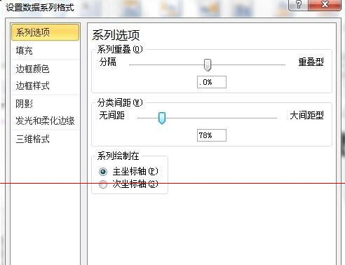
11、设计柱形之间的间隔距离。双击柱形,弹出格式设置对话框,拖动滑块改变系类重叠和分类间距的值。

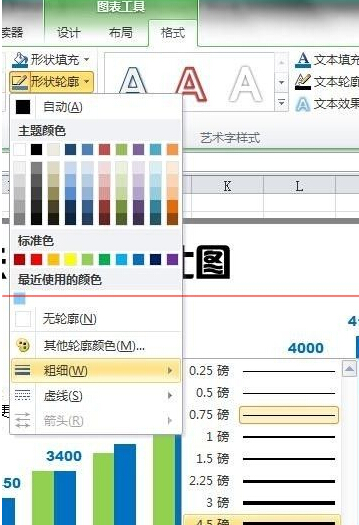
12、再为图增加一个边框。在格式→形状轮廓中选择颜色,选择边框的粗细和线型。可以适当宽点。得到最终美化的柱形图。
以上就是如何在Excel中制作柱状图的全部内容了,大家都学会了吗?


")
")


语音转文字!新媒体翻译者都有哪些实时语音转文本工具?")


